The app linked below uses the {shinydashboard} and {ggiraph} packages to create an interactive visualization of Indian electricity and latrine access data.
https://seanangio.shinyapps.io/shinydash/
You can also find its Github repo.
While two previous iterations using this dataset focused on various geospatial representations, this project seeks to shed light on the question of how access to electricity and latrines vary with respect to each other. To what extent do high performers in electricity access also score well in latrine access? How do these metrics vary over time? Across different societal groups? Among urban vs. rural households? At state and district levels? In particular geographic regions?
The vastly uneven population counts across states and districts led me to choose visualizations that allow a raw count like population to be mapped to a size aesthetic, specifically a scatterplot, a dumbbell plot, and a bivariate choropleth. Of course, each has their own particular strengths and weaknesses.
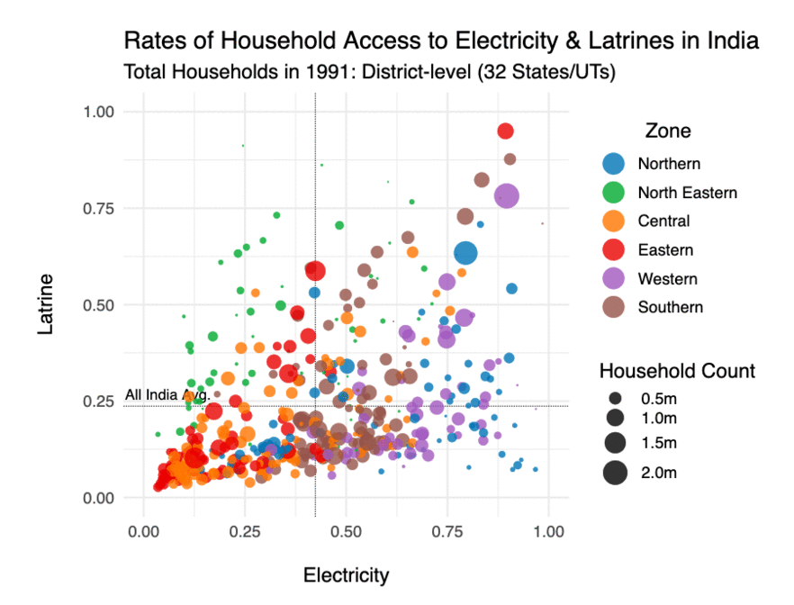
District-level scatterplot across time
The scatterplot below is an example of how districts in India have improved their access to electricity and latrines over three decades, but have done so at significantly different rates. It is also interesting to examine the distribution of points. Generally, electricity rates are greater than latrine rates, but this is not exclusively the case.
Moreover, the dotted lines showing the All-India averages for the selected data divides the plane into four quadrants, identifying states or districts above or below the country average. We might expect to see the top right and bottom left quadrants: places that either do well or do poorly in both electricity and latrine access. The bottom right quadrant is also fairly easy to understand because electricity access tends to exceed latrine access, as demonstrated most vividly by the dumbbell plot. The top left quadrant however, those cases with above average access to latrines but below average access to electricity, are particularly interesting. I do not have any strong intuition for what is happening in this quadrant.
Dumbbell plots
The state dumbbell plot below is well suited to showing the gap between a state’s household rate of access to electricity versus its rate of access to latrines. Dotted lines highlight cases where this relationship is reversed, and the rate of latrine access actually exceeds that of electricity.
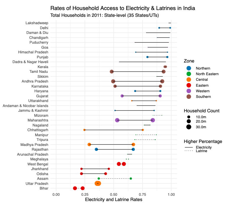
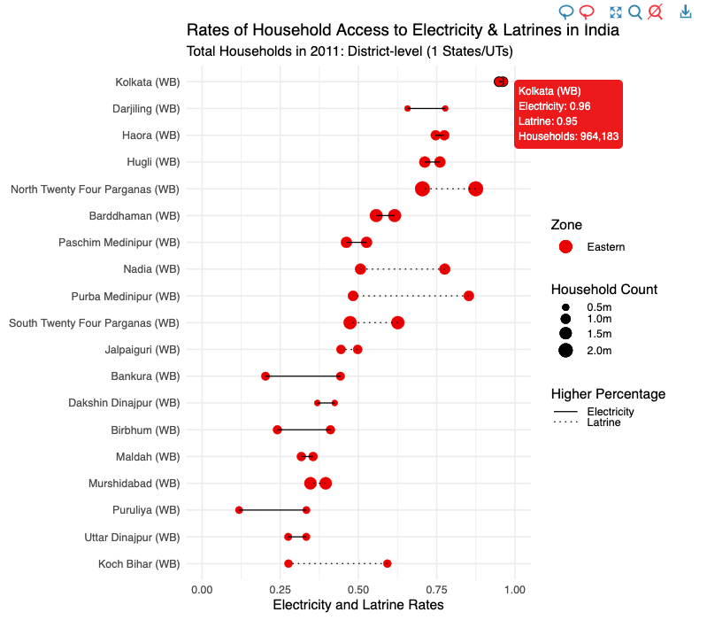
This plot above is busy, but readable at the state level. However, we can dive deeper into any particular state using the geographic filter. The plot below shows the same data for districts in the state of West Bengal.
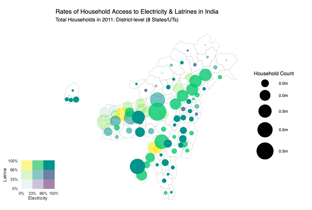
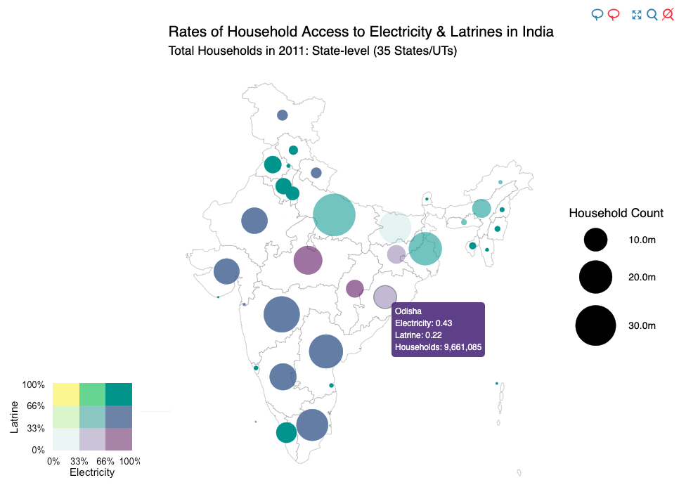
 ## Bivariate Bubble Map
Previous iterations of this project have used choropleths to map the household rate of access to electricity or latrines. However, depending on the underlying data, we would be unable to map both of these metrics simultaneously.
A bivariate color scheme, however, does enable us to track two variables at the same time. Although we have much less precision in any one category, we can place states or districts into a two-dimensional color bin instead of a typical one-dimensional scale.
 At the district level, bubbles can become quite crowded, but if we filter to a particular state or region, we can observe the data more clearly, as done here for districts in the Northeast states.