Linting Documentation Code Samples
python
claude
markdownlint
blacken-docs
ruff
json
pydantic
openapi
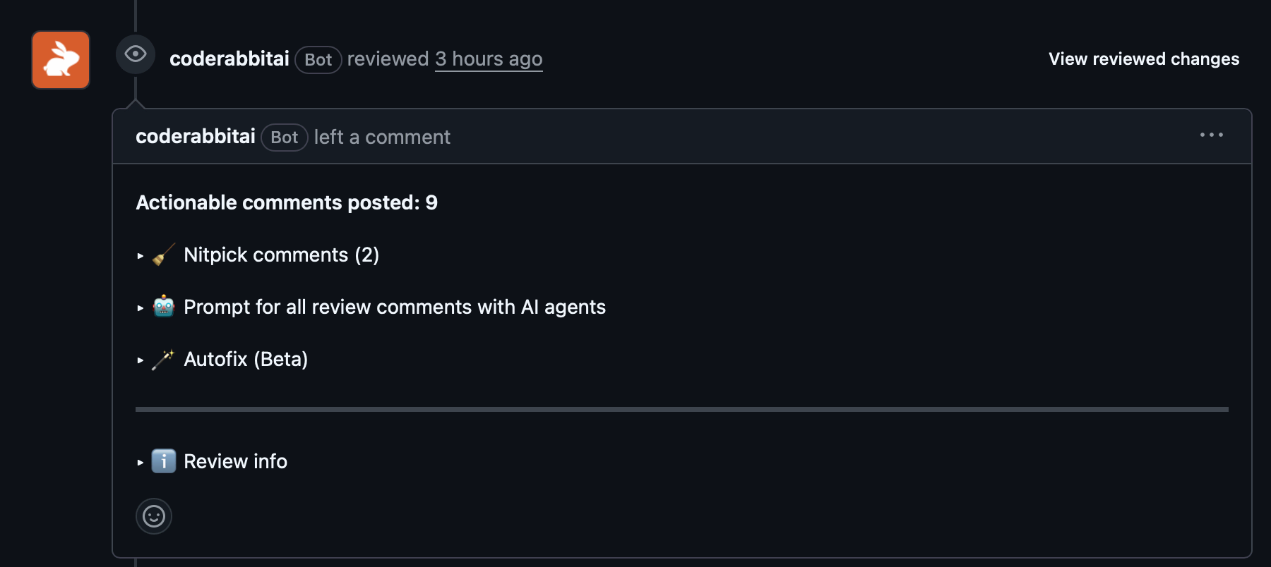
AI Peer Reviews of Documentation
python
claude
coderabbit
copilot
ollama
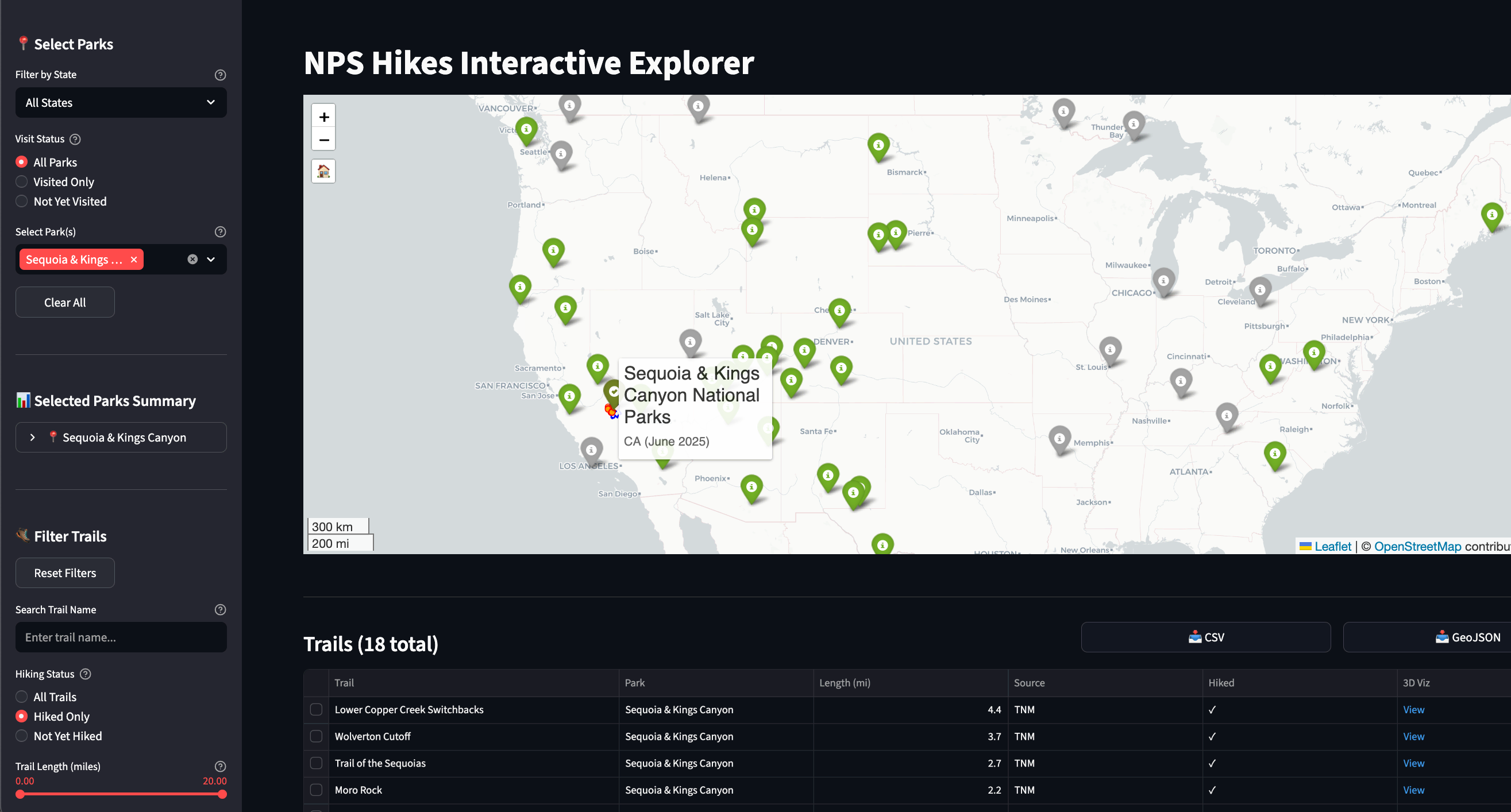
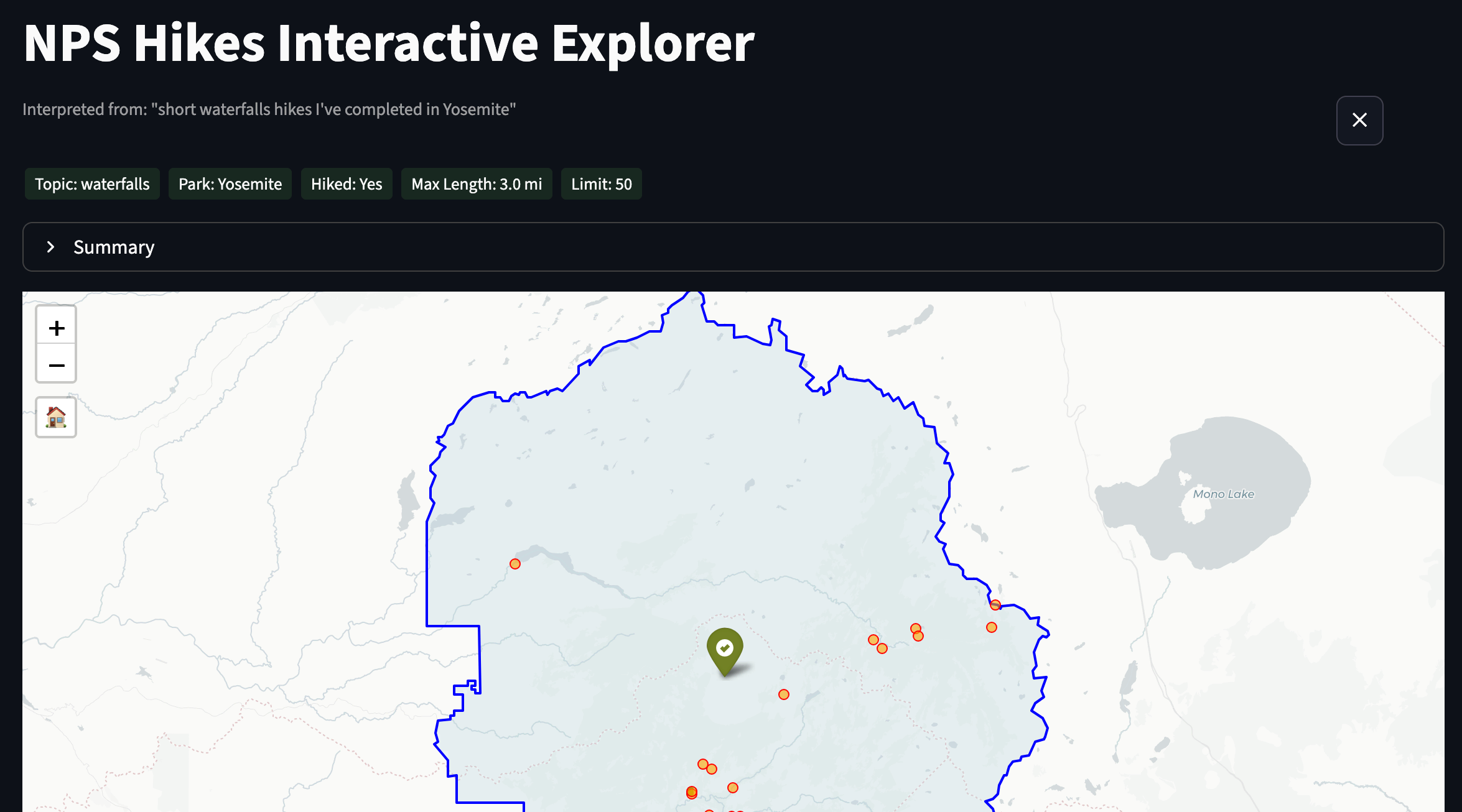
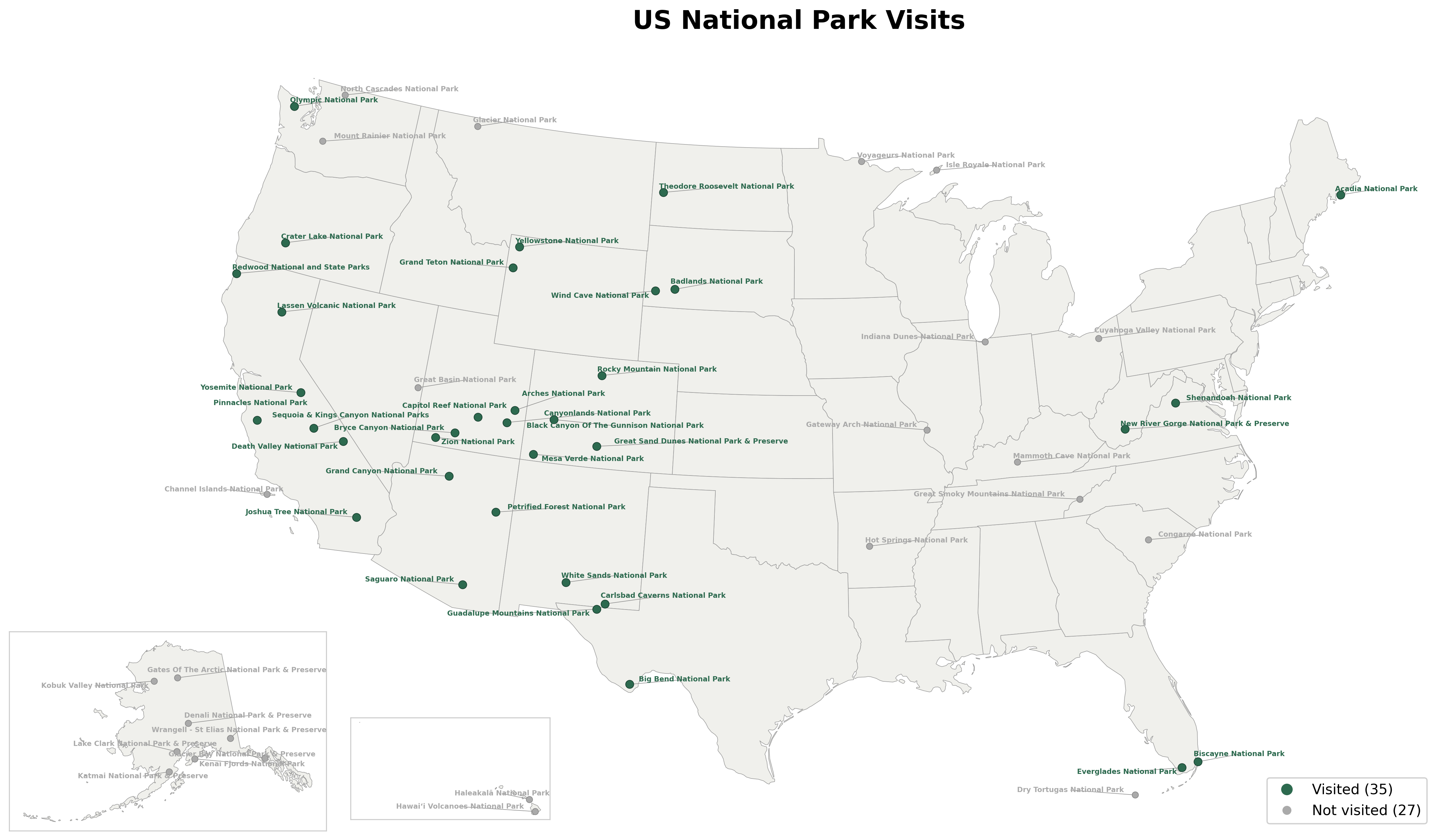
Product managing a Streamlit app
python
claude
streamlit
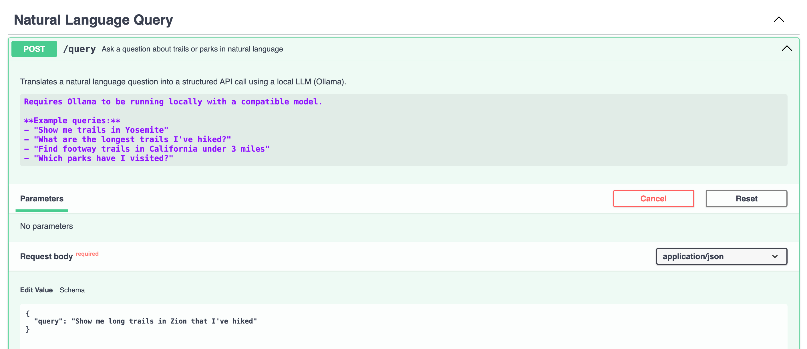
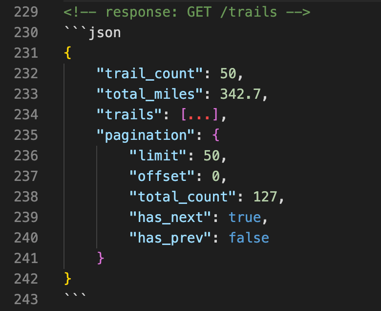
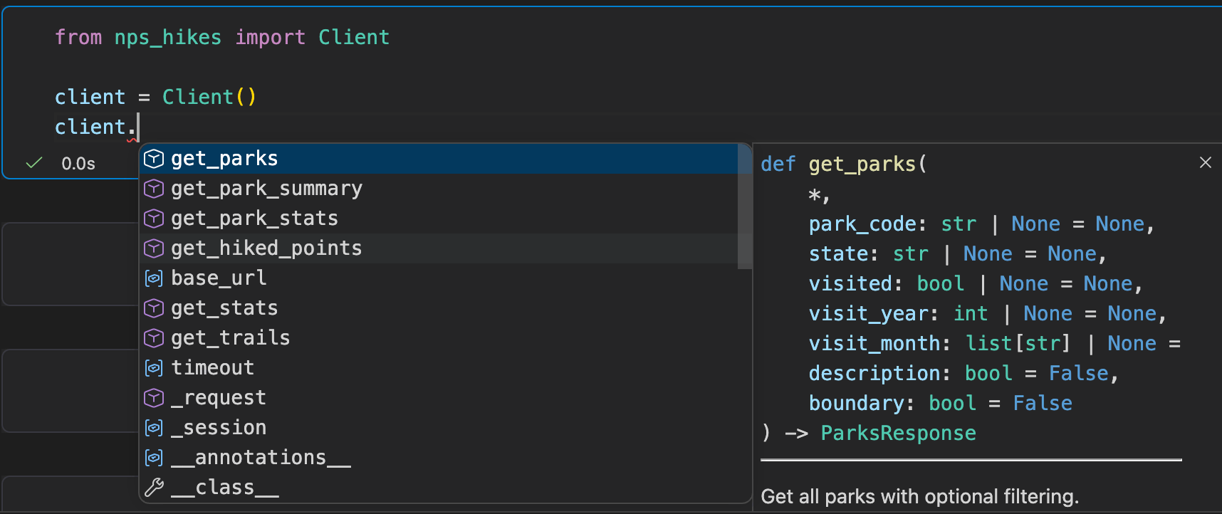
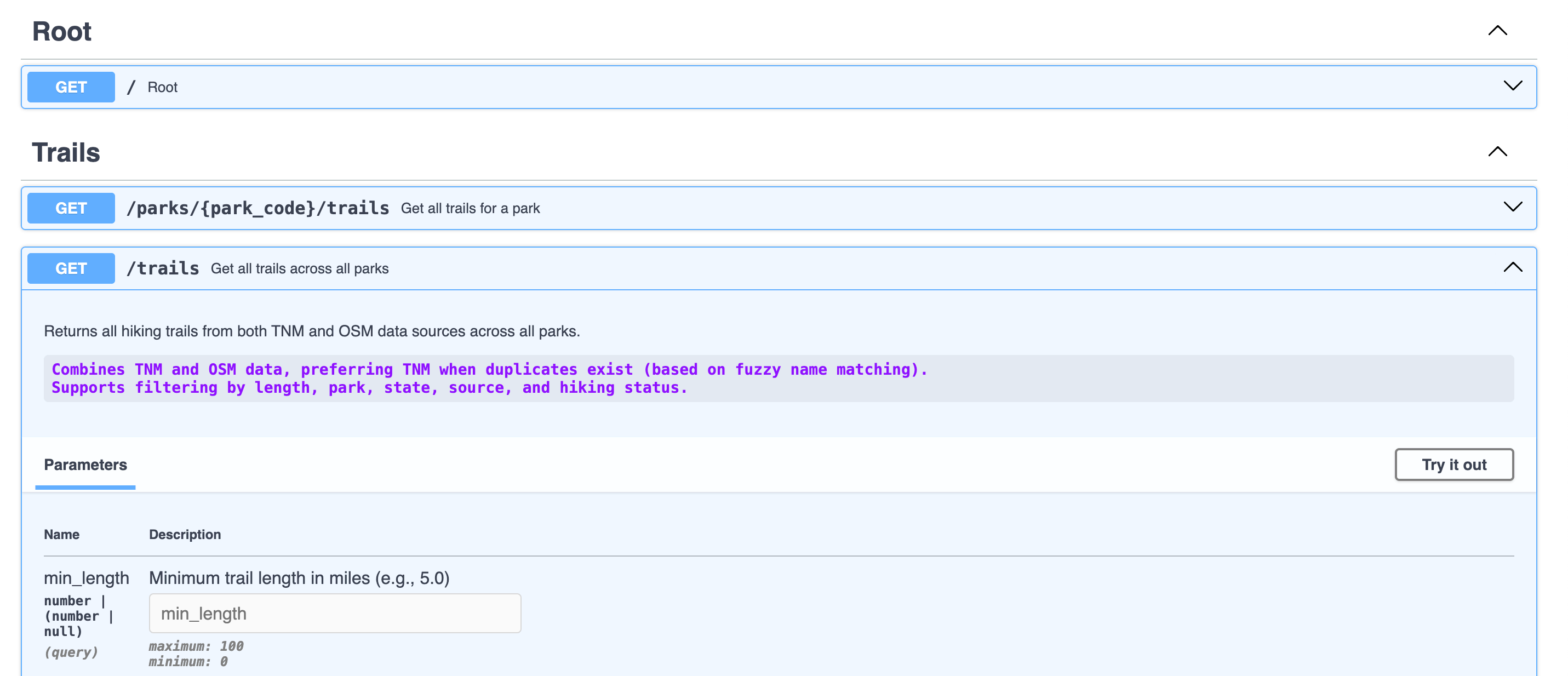
Adding an NLQ Endpoint with Ollama
python
claude
ollama
nlq
Building a Documentation Site with MkDocs
python
claude
mkdocs
docker
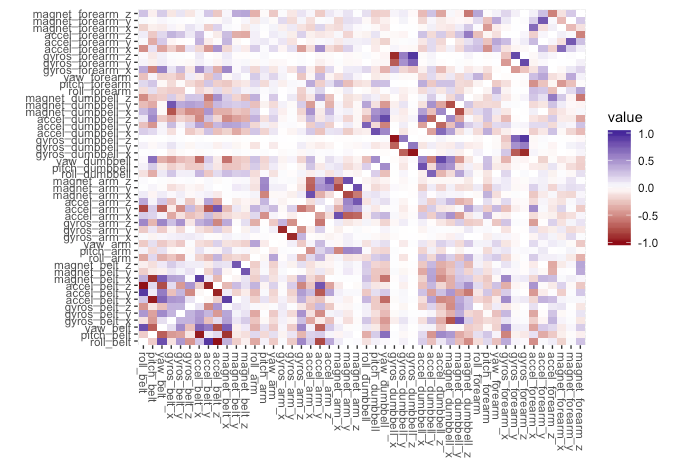
Data Validation, Code Linting & Type Checking
python
claude
pydantic
pandera
black
pytest
pre-commit
github actions
Porting an R web app to Python with Claude Code
python
claude
streamlit
shiny
Vibe Coding a Data Pipeline
python
cursor
claude
postgresql
sql

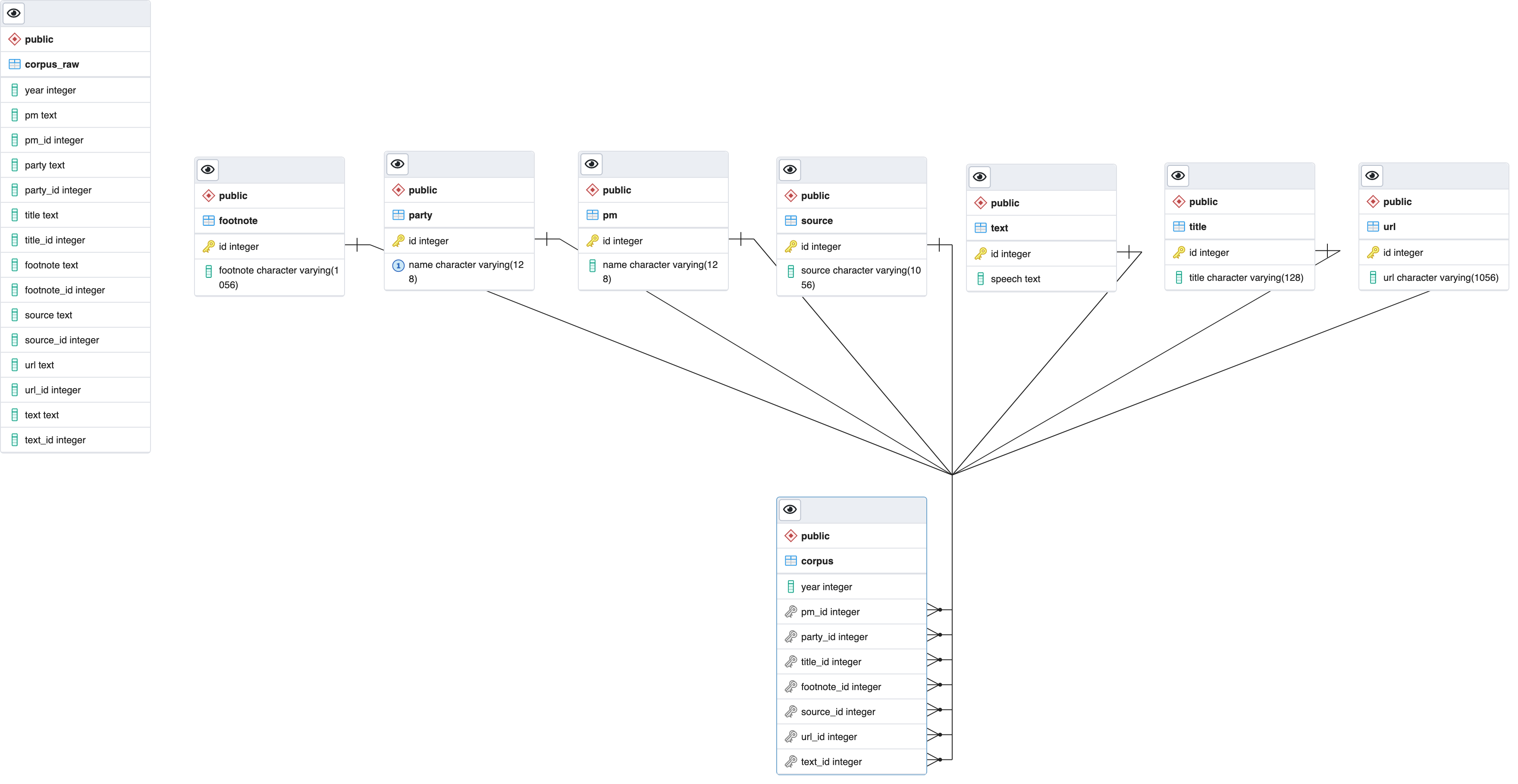
Text Data in PostgreSQL
SQL
PostgreSQL
DBI
RPostgres
NLP
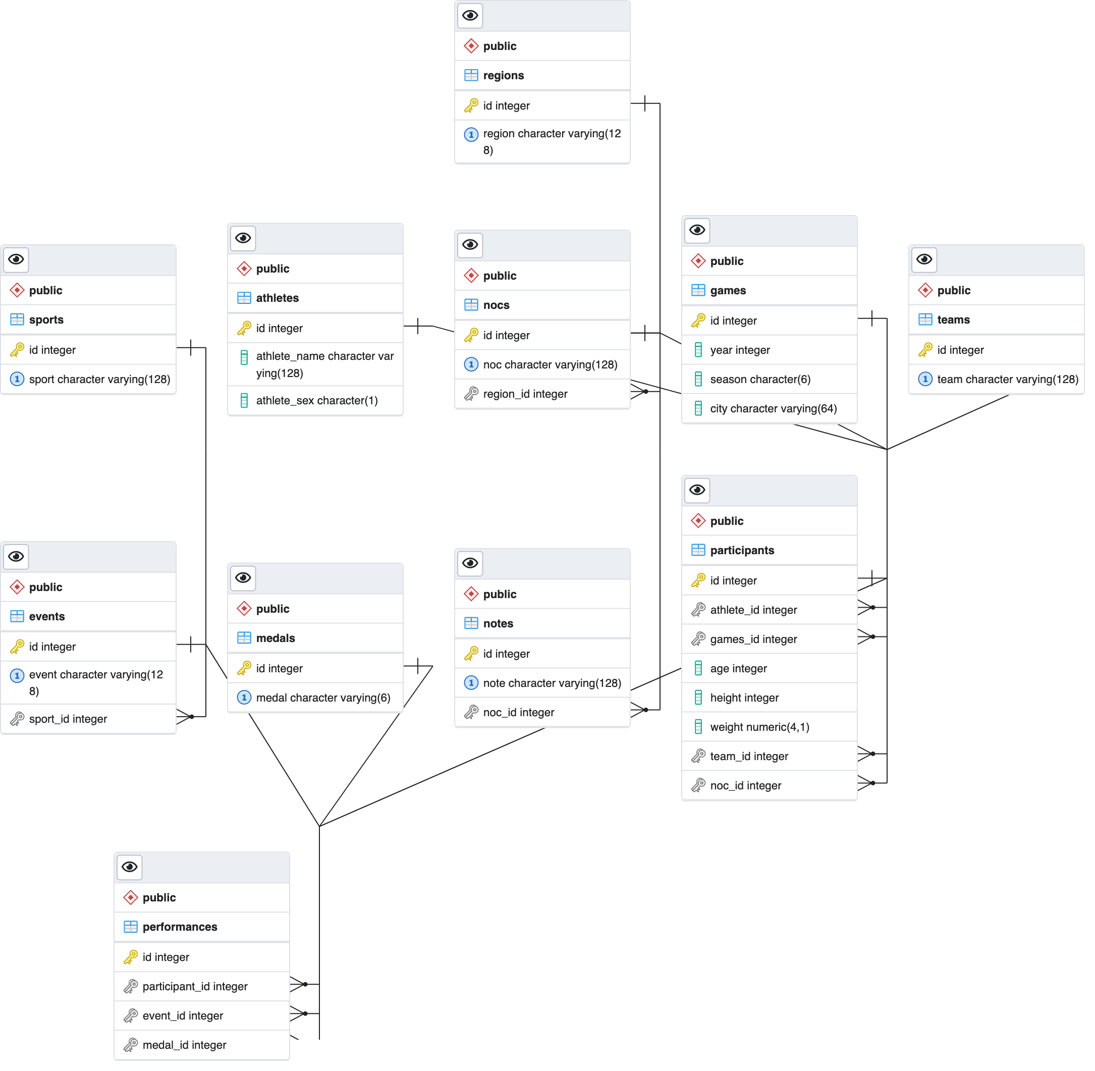
PostgreSQL Database Design
SQL
PostgreSQL
DBI
RPostgres
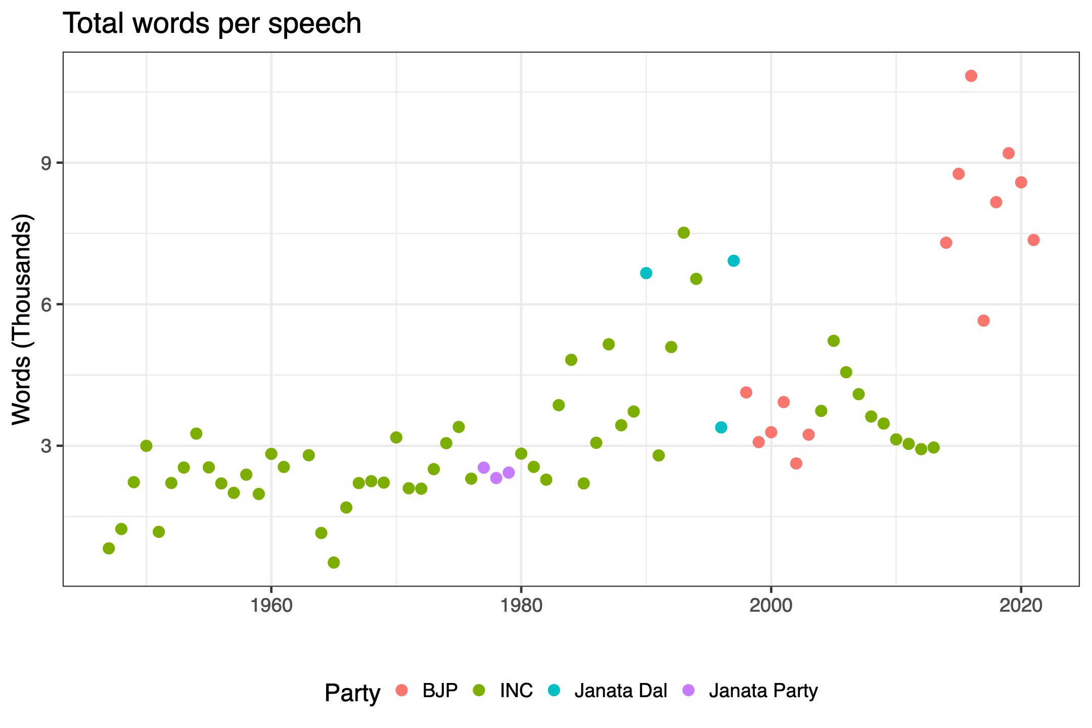
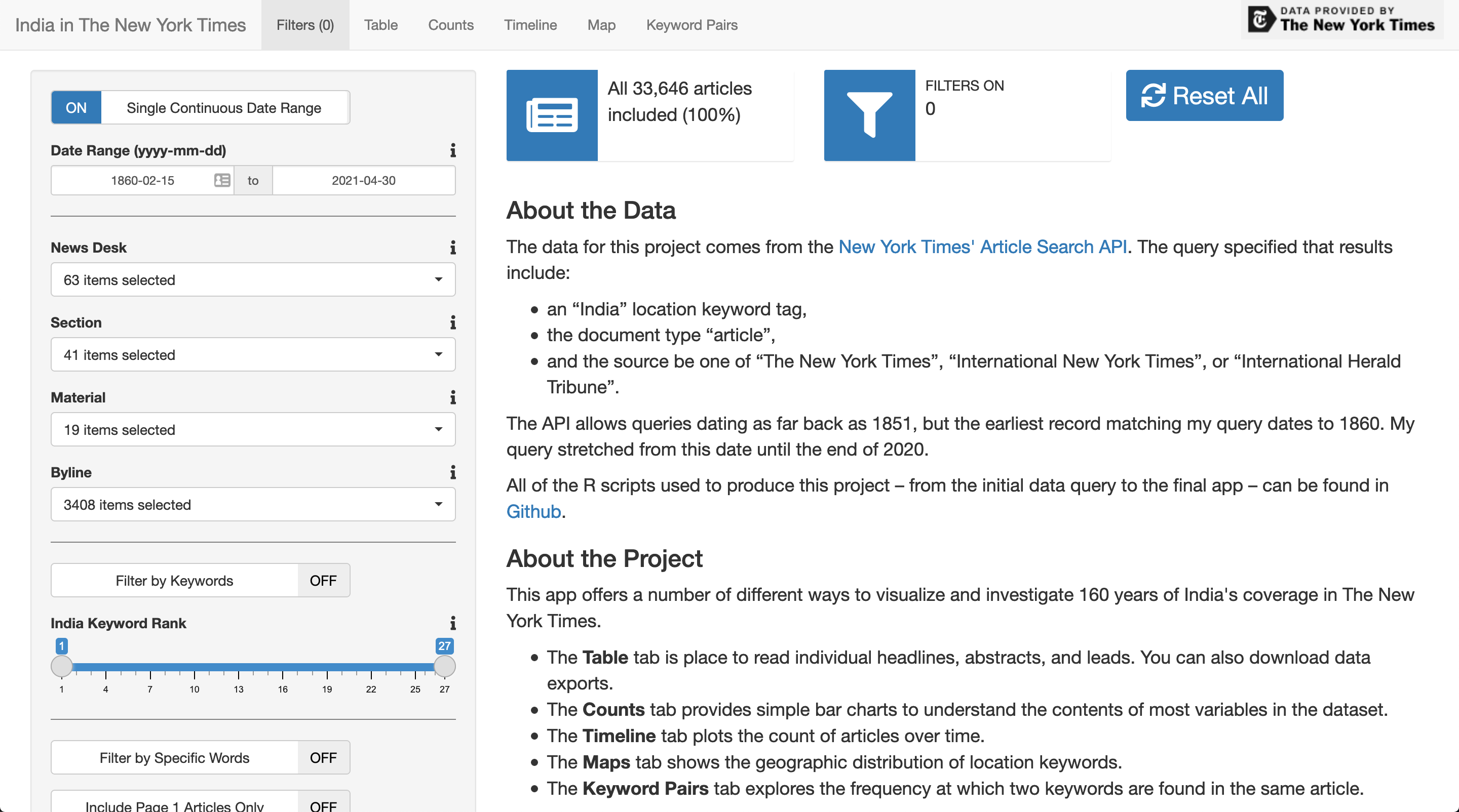
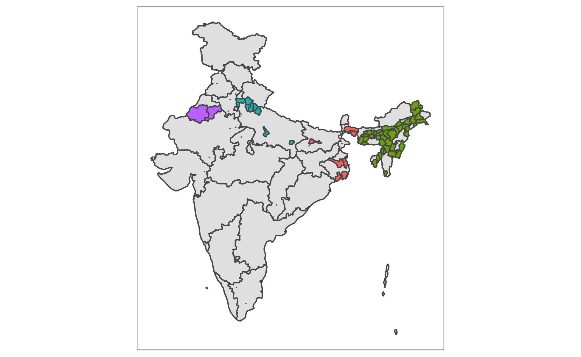
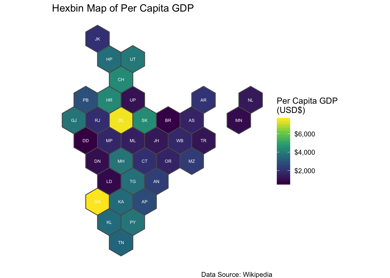
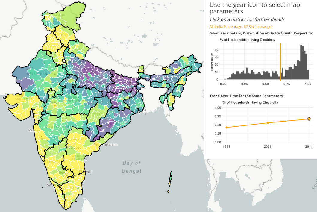
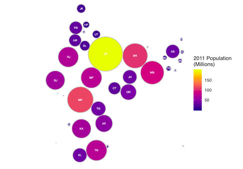
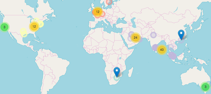
An R Data Package for Preparing and Visualizing India-tagged Data from the NYT Article Search API
open-data
r-packages
shiny
leaflet
tidyverse
ggiraph
ggplot2
dygraphs
DT
gt
Working with Databases in R
SQL
dbplyr
sf
PostGIS
rpostgis
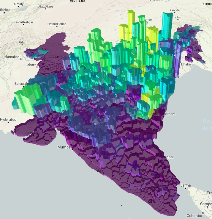
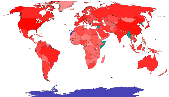
Animated and Interactive Maps in R
tmap
sf
gganimate
mapview
leaflet
plotly
ggiraph
crosstalk
shiny
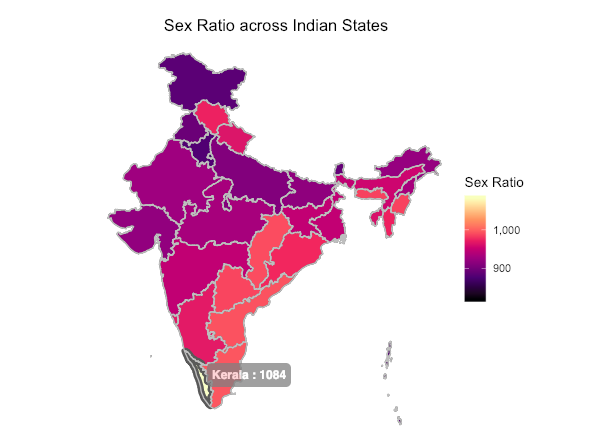
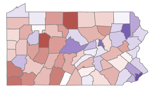
Static Maps in R
tmap
sf
ggplot2
cartogram
geogrid
geofacet
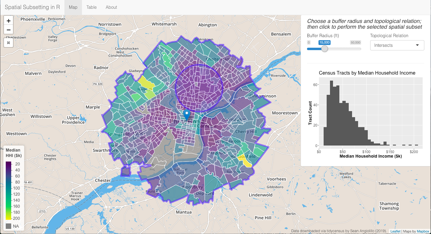
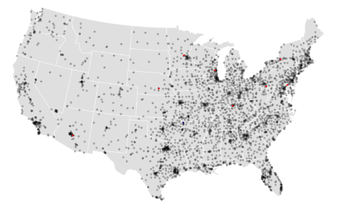
Spatial Subsetting in R
sf
leaflet
ggplot2
tidycensus
tigris
geospatial
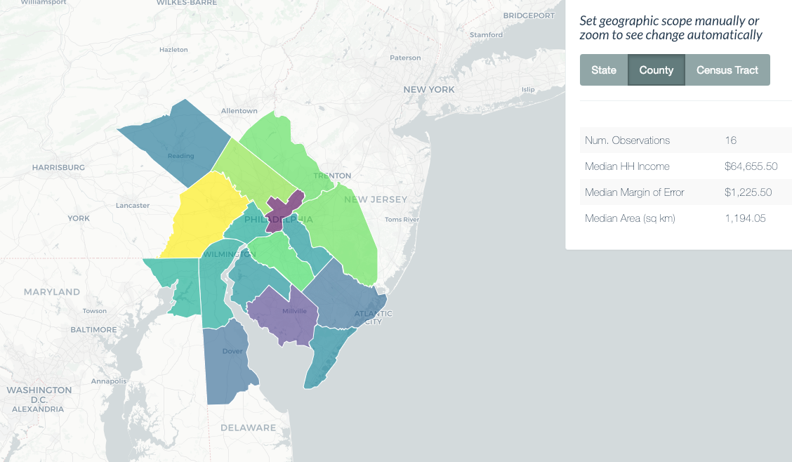
Interactive Choropleths with Shiny and Leaflet
sf
shiny
leaflet
ggplot2
geospatial
Zoom-Triggered Actions in Leaflet and Shiny
sf
leaflet
shiny
ggplot2
tigris
tidycensus
geospatial
Generate Choropleths and Cartograms in Shiny
sf
ggiraph
shiny
cartogram
geogrid
geospatial
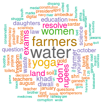
Text Mining: TF-IDF & Sentiment Analysis
tidytext
shiny
ggplot2
rvest
NLP
Animating Dosas
gganimate
leaflet
tidyverse
rvest
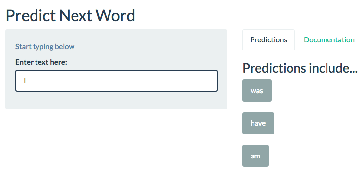
Next Word Prediction
shiny
tidyverse
data.table
NLP
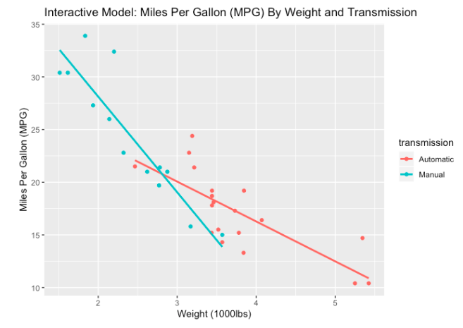
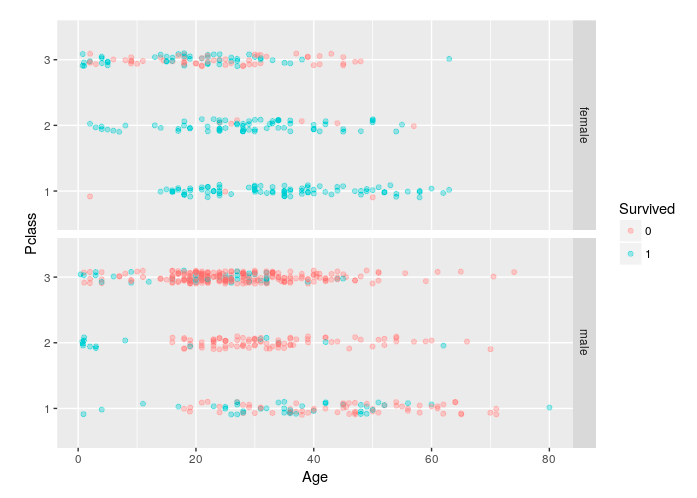
No matching items