The app linked below uses the {mapdeck} library to compare common thematic mapping styles using Indian electricity and latrine access data. These styles include a choropleth, a dot density map, a proportional symbols map, and a 3D choropleth.
https://shiny.socialcops.com/thematic_mapping/
You can also find its Github repo.
A brief summary of pros and cons of these thematic maps is below. For a fuller treatment, please see my SocialCops blog post on this topic.
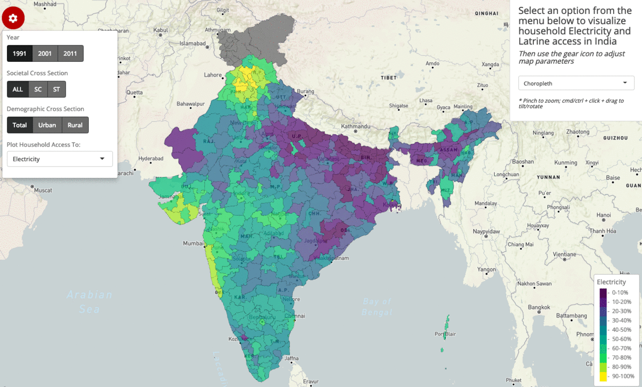
Choropleths
A choropleth gives the simplest view of the spatial distribution of a standardized rate, but conceals the vastly-different underlying population counts.
Choropleth of Indian household electricity access (1991-2011)
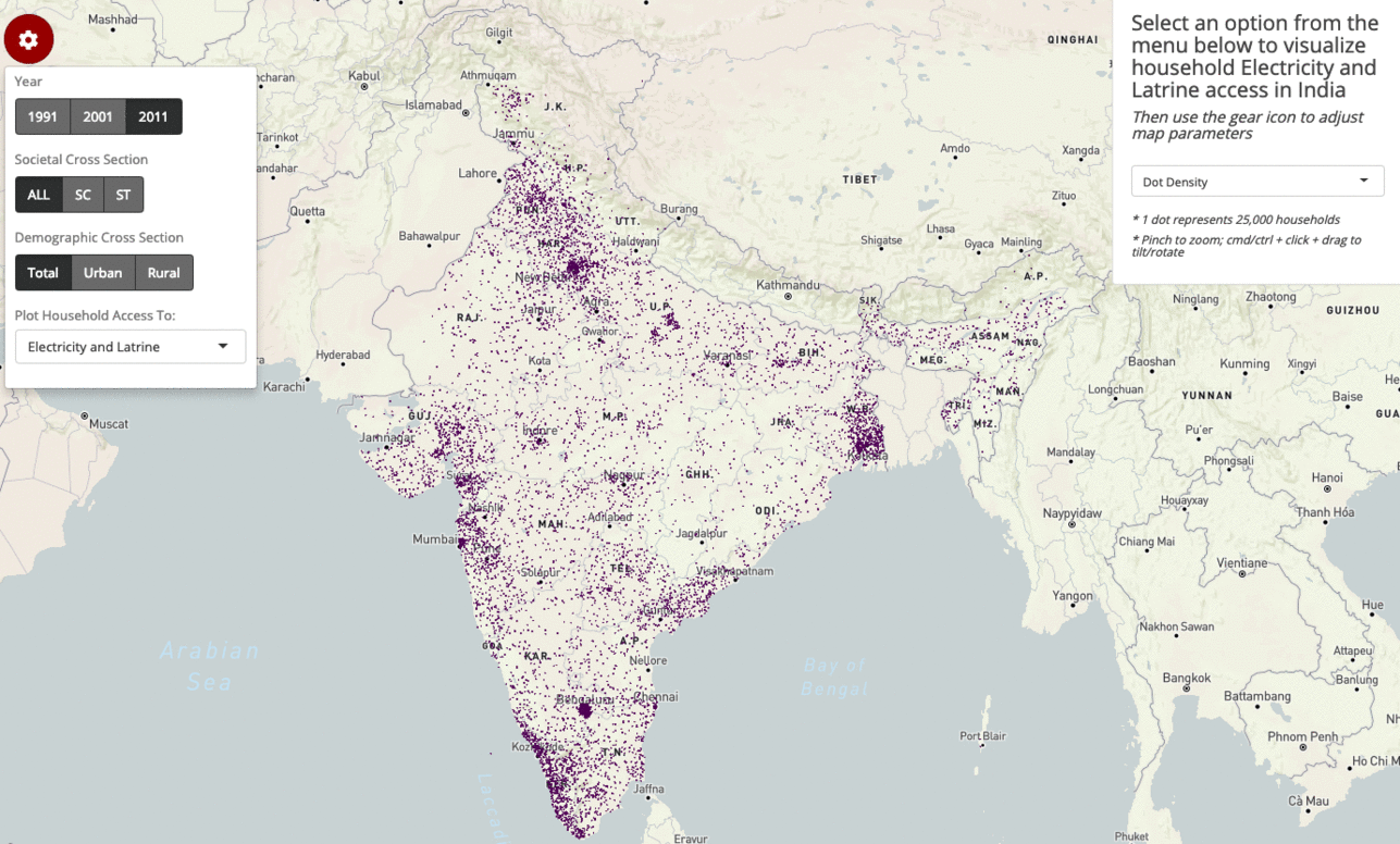
Dot density maps
A dot density map provides a method to spatially visualize clusters of a raw count, while sacrificing the ability to retrieve numeric data.
Dot density map comparing urban and rural households having access to both electricity and latrines (2011)
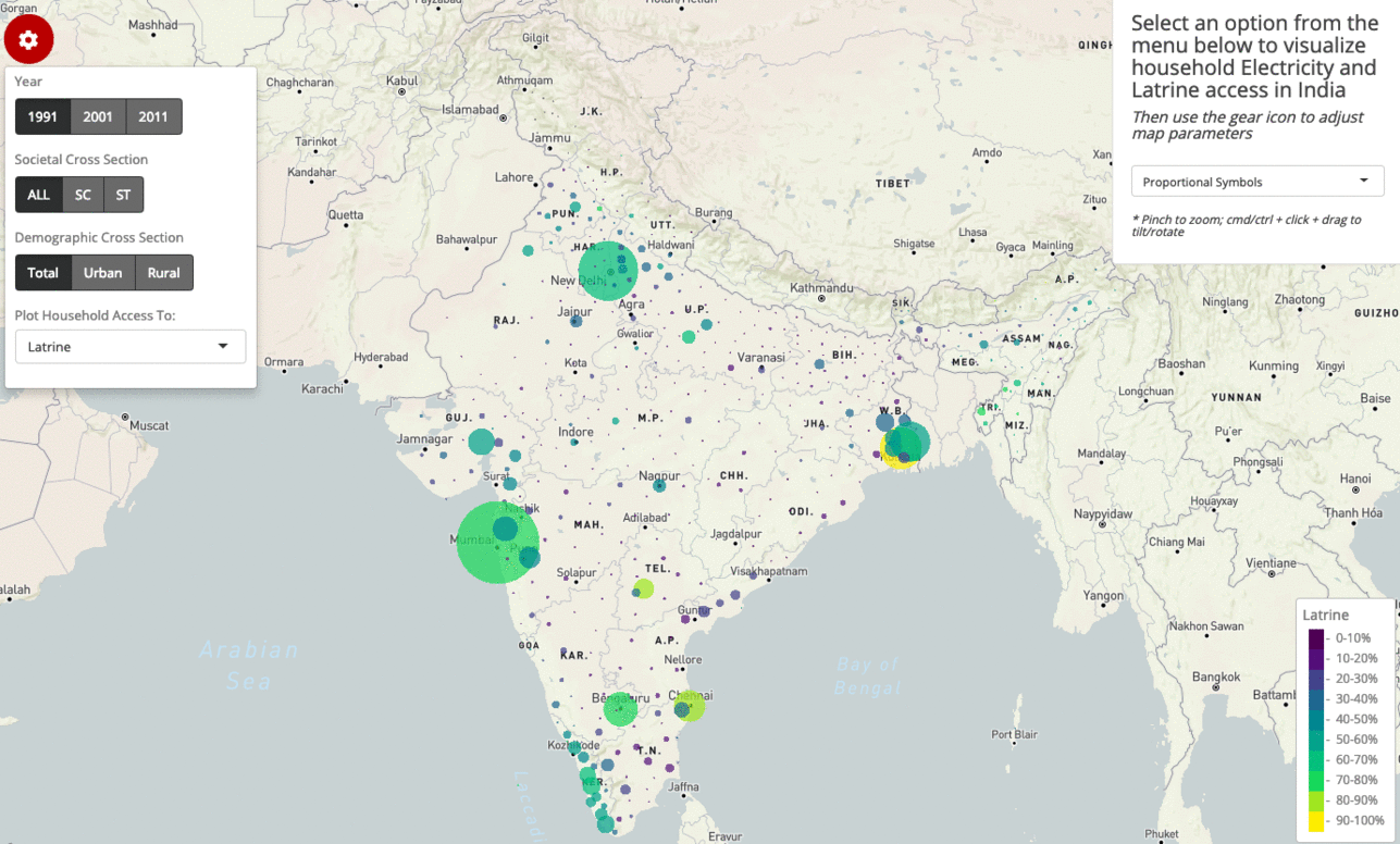
Proportional symbols maps
A proportional symbols map can communicate both a standardized rate and a raw count through the color and size aesthetics, yet congestion is often a dilemma.
Proportional symbols map depicting household latrine access (1991-2011)
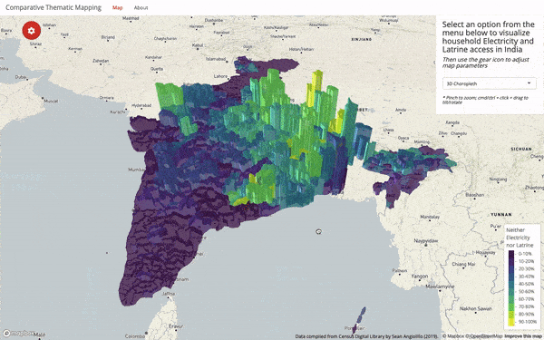
3D choropleths
A 3D choropleth can map a rate and a raw count, while preserving the original geographic shapes, but at the cost of visual clarity.
2011 households having access to neither electricity nor a latrine